So - you’ve got your digital signage installed and connected to a CMS. Phew! But you’re not done yet.
Understanding good digital signage design is almost as important as making sure your screens are switched on! You’ll need to understand the best way to lay out your content, how to make it as easy-to-read and effective as possible, and you might even to get familiar with terms like “dwell” (don’t worry, we’ll cover that in this guide!)
Fear not - we’re here to help, with a list of The 10 Commandments of Good Digital Signage Design. If you fancy getting hands-on and designing content using these principles, you can sign up for a free trial of Fugo, hop in and experience what digital signage content creation is like with a provider that takes care of all the little things (like file optimization, aspect ratios, and screen resolutions) so that you can focus on the big stuff — publishing your content to your screens.
Let’s get into the scripture.

1. Thou shalt follow the golden ratio.
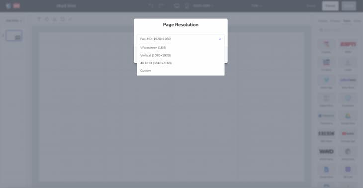
First and foremost - every artist needs the right canvas. Designing content for screens is different from other formats (like web, or print) in a few key ways, starting with the dimensions and aspect ratio of your screens. Your screens will almost always be in one of two ratios: these are 16:9 for landscape screens or 9:16 for portrait screens.
On top of that, you’re going to need to consider the resolution of your screen. This is the size of your screen, measured in pixels, and it’s something you need to consider because if you’re not using high-resolution images or video, but you’re using a super high-res screen, you’ll end up with a blurry, pixelated mess. Your resolution isn’t tied to the dimensions of your screen, so it’s good to refer to your manual and find out what resolution your screen uses.
All these measurements; it’s enough to make your head swirl!
Don’t sweat though. Fugo’s Content Studio comes with an easy-peasy Resolution Selector, meaning you can pick the right resolution to display your content in while you’re designing it. You can also flip the canvas between 16:9 and 9:16 any time, meaning you’re able to accurately preview how your digital signage content will look before putting it up on your screens.
2. Thou shalt keep file sizes small.
When you’re working with images, audio, or video, you’ll need to make sure you’re in the file size sweet spot. This will depend on the type of file you’re working with (videos typically take more space than an image, for instance), but should usually be between 2 and 3MB at the maximum.
Having a larger file size typically means you’re able to have a higher-quality file. Audio will be able to be crisper and richer, images will be able to bigger and videos will be able to be higher-resolution. However, you don’t want to make the files so big that they become slow to download over Wi-Fi (leaving blank spaces in your design) or eat into your storage space.
Digital signage content creation can be a confusing experience, but Fugo can help with this point, too; our CMS automatically optimizes files, keeping sizes down and quality high.
3. Thou shalt make fonts & text legible.
There’s a bit more to this one than it would seem at first glance - so let’s break it down into a couple of key points (or sub-commandments, if you prefer!)
a. Three by five
When working with text in a digital signage design, it’s important to communicate as much as you can in as few words as possible. Your viewers will not be reading the text on your screens from up close and personal, and might actually be walking past the screen as they read (rather than sitting down and taking the time to focus).
It’s quite easy to overlook that when you’re creating content, especially when you’re trying to sell your brand or advertise a product, so you can make it easier for yourself by remembering the Three By Five rule.
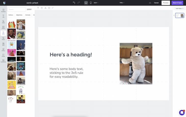
This rule says that when creating text, you should limit yourself to either three lines of five words each, or five lines of three words each. This helps to focus your ideas and make sure you keep your text clear and punchy, as well as allowing you to not clutter your screen up too much with walls of text. Another benefit of creating text that follows this rule is that you can increase font sizing, something we’ll cover in the next section, which is always helpful for digital signage content that might be read from across a room.
b. Size and styling
One of the biggest differences between anything you create for digital signage, and other media formats, is the way that content will be viewed. We’ve mentioned font sizing in the previous section, and that’s particularly important for content on your displays because they’ll typically be looking at the screen from much further away than other media.
You’ll want to use a font size of at least 20-30pt for your body text (as that’s visible from around 7 feet away). This is a decent compromise between having gigantic text that swamps the rest of your design and forcing your readers to squint if they want to make out what you’ve written.
It’s not just font size that you’ll need to consider, though! Surprisingly, your actual font choice makes a difference too. Using sans-serif fonts, such as Arial or Helvetica, is always recommended over other fonts. Serifs can confuse your readers’ eyes and cause issues with clarity at a distance. You’ll need to make sure your kerning (the space between letters within words) is big enough to prevent letters from looking like they’re merging together (for example, a “c” and an “l” can easily look like a lowercase “d” on your displays if the kerning isn’t high enough.
On top of all of this, you’re going to want to avoid using italics too often. It tends to compress words and thin the fonts out and affects how letters are spaced out - so it’s better to stick with bold or underlined if you absolutely have to format your text for emphasis!
c. Keep it simple
That was a lot to think about, right? Thankfully, this one’s pretty easy. Just don’t use too many different fonts. Typically, you should use one font for headings and another for longer-form body text — but absolutely stay away from using more than 3 different fonts in a single slide. It is the same tip used in web design. This is because you can use fonts to imply a hierarchy, or importance, to the content that you’re displaying, which helps readers understand and absorb information without having to focus too hard. When you start to overload readers with too many fonts and a confusing layout, it’s harder to get them to connect with and understand the content you’ve created!
4. Thou shalt obey screen layout principles.
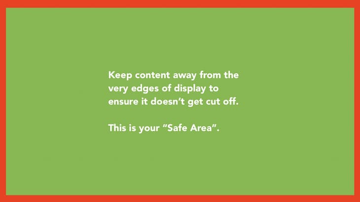
The way your content is laid out on the screen can be arguably as important as the content itself! Most importantly when it comes to your layout, you’ll want to make sure your content stays within the Safe Area of your display. This just means it stays visible and away from the edges, avoiding having important text or calls to action cut off by the bottom or sides of your screens.
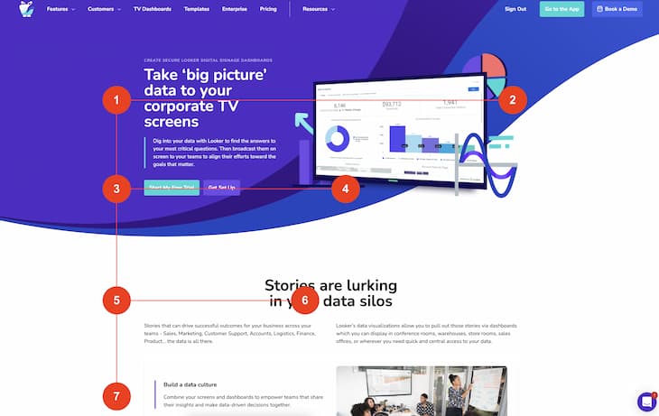
When you’ve made sure your content is all visible, you should consider the way that people read. When viewing content, the eye travels in an “F” pattern, starting at the left side of the display, scanning across towards the right before moving back and scanning downwards. Then, it goes across again, but typically not as far as the first time. It’s unusual, but if you can accommodate that by having your most important content be focused in the leftmost third of the screen and allow the rightmost third to be a bit more open, you’ll be working with your reader instead of against them.
A good example of this F layout can be seen with a lot of restaurant digital signage, which usually shows a menu in the left half or third of the screen and then leaves the right side open for photos of the food rather than menu items and prices.
It can also be a good idea to stick largely to a grid layout, placing your most important content at the intersecting lines of your grid. This is predictable, so your readers will understand intuitively where to look when they view your screen, getting the information they want quicker.
5. Thou shalt create visual contrasts
Alright, we’re back to something a bit more straightforward; colors!
Contrast is a huge part of digital signage content creation. You can use bright colors and high contrast to emphasize the most important pieces of content on your displays by drawing the viewer’s eye to them.
But, again, like a lot of things - it’s not all quite as simple as it seems. For instance, you’ll want to avoid using too many colors. Too many colors on the screen can make it difficult for viewers to figure out where they should be looking, and can even make it a little bit difficult for them to focus and really see what you’re looking at!
Contrasts can really help with legibility for text as well. If you’re using dark text, make sure you put it over a light background. If you’re using a lighter text color, put a dark background behind it to create a contrast and help to make it more legible! If you’re planning to put text over an image, it can be helpful to put a dark overlay between the image and text, and make the text white. This can help to ensure a minimum amount of contrast between your text and lighter parts of the image, and can safeguard your text from not being legible anymore.
When you’re working with smaller icons, or text that has outlines, make sure you use thicker stroke widths to provide some contrast between the surrounding elements, making your icon easier to see. If the outline or stroke widths are too thin, it might be difficult for viewers to clearly see what the icon is. This also goes for any text on your display - don’t make your text transparent; it’s a recipe for headaches and eye strain!
6. Thou shalt chill out with screen zones
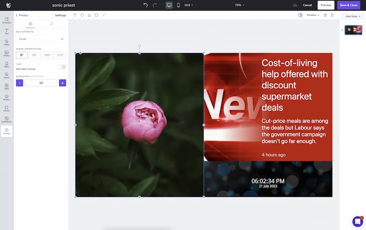
One of the biggest upsides of digital signage content is the ability to have screen zones - separate spaces of the screen that show different content. The Fugo design studio actually gives you a super easy way to manage multiple screen zones, with a handy drag-n-drop editor which includes snapping (meaning you can easily line up your zones neatly along grid lines, which can help you follow Commandment 4 above!).
However, while this is a big bonus - because you can display all kinds of different, dynamic content - it’s also very easy to go overboard. With every additional screen zone, the attention of your viewers gets spread thinner. If you start overloading your viewers by having way too many screen zones, you’re going to get a worse ROI for each one!
Also, while we’re on the subject — absolutely no more than one video should be playing at a time. That’s a cardinal sin.
Here’s an example of three screen zones being used in the Fugo Content Studio:
7. Thou shalt consider dwell times
Let’s talk about dwell times (see, I told you we’d get round to it!). It’s actually not too complicated - the clue is very much in the name! “Dwell times” refer to the time your audience will actually be in front of your screens. You should be factoring this in whenever you’re creating digital signage content, because it makes a huge difference to the kind of content that’ll be effective!
Here are some loose dwell time guidelines, by audience:
- Passerby - less than a minute (Short-term viewing).
- Staff member, customer in a coffee shop, client in a reception - 1-2 minutes (Mid-term viewing).
- Office worker, sit-down customer, or person in a waiting room - 2-30 minutes (Long-term viewing).
8. Thou shalt be a smart scheduler
One of the aspects of digital signage boards that really give them an edge over traditional, or paper, alternatives are the ROI they can offer. You can show multiple pieces of content, throughout the day (or even week - more on that in just a second), in the same space; saving you money and helping your business to be more reactive and dynamic.
But to make the most of something as unique as this, you have to be smart! There are really two different sides of scheduling that are important to digital signage, so let’s go through them now:
a. Content Scheduling
This section is specifically more focused on the content itself, rather than its placement within playlists.
One of the most important things to bear in mind is how long your content will be displayed. If you have a complex or wordy message in your content, try reading it backwards to get an idea of how long it might take somebody to read it for the first time. Is your content on-screen long enough for your audience to read and understand your messaging?
Even if you have no words in your content, this could affect you. Are you showing QR codes? You’ll want to make sure there’s enough time for a user to whip out their phone, boot up the camera app (or any QR scanner app), and focus on the code on your display - which might take a little longer than you expect!
How about videos? Remember to make sure your content is shown for long enough for any videos you’re playing to finish.
Outside of just display time though, you’ll need to make sure that you keep your content fresh. How many times have you visited a website online, only to find that their last content update was years ago? How many times have you walked past a store, seeing the same offer posters up? It makes it seem like your business is either closed down or not going anywhere - and even on digital signage, stale content can give off the same impression!
You can keep your content fresh by integrating with apps that help automate the process of refreshing your content for you. You can pull your Instagram or Twitter feeds in, or (in an office setting) you can use BI dashboard apps like Looker or Geckoboard to automatically keep your data fresh.
b. Playlist Scheduling
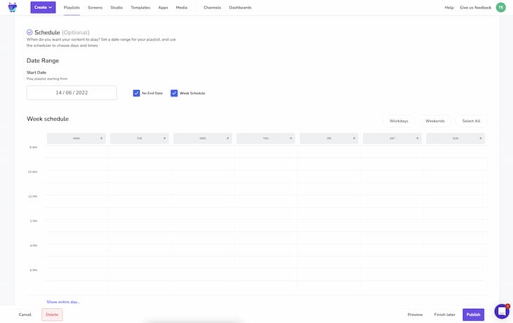
So, this is a wider section, covering how to put content in a playlist as opposed to your content specifically. Fugo has a great, easy-to-use playlist scheduler that can accommodate all kinds of content and schedules - but how do you use it to make the most of scheduling?
We generally recommend that playlists should have between seven and ten separate pieces of content. For the average viewer, it’s more effective to show a message repeatedly than it is to show a message for longer durations - meaning you shouldn’t bloat your playlists too much, because you want to be able to display the same message multiple times. You should aim to be able to show a message to an audience member seven times to help them internalize it, which means you’ll have to tweak the runtimes of each piece of content.
It’s also a good idea to cater your playlists to the time of the day, or even the day of the week. For instance, if you have special offers running on Tuesdays as a lot of take-out places do, it could benefit you to have a “Two for Tuesday” style playlist that only runs on Tuesdays. On other days of the week, you might want to display other day-specific content. Saturdays and Sundays are also great days for this kind of catered messaging (and this is something that the Fugo playlist scheduler makes very easy!)
We also recommend that you aim to have one piece of content be constantly visible. This can provide an anchoring point for your audience, and can even encourage them to spend more time looking at your displays - for instance, how many times have you been in a reception area or a restaurant, and have checked the signage to get the time rather than pulling out your phone or looking at your watch? I know I’ve certainly done that, and it’s always helpful. You could also display something like the weather forecast for the day, too.
9. Thou shalt preview your content
This is one of the most important pieces of advice, not just on this list or specifically for digital signage, but for almost anything. Like, ever. Always preview to make sure you’re looking your best before you release any content to your audience - because even one typo can really change how people see your business! I know for sure that if I walk into a fast food place and there are typos on the screens, I’m going to be slightly nervous about the state of the kitchen - which might seem a little unfair, but appearances really are everything!
But beyond straight-up errors in your content, it’s also worth previewing your content so that you can check just how readable it is, and make adjustments to make sure your eye is drawn to the right place. If you have a spare screen, you can send your content or playlist directly to just that one, using the Fugo publishing options, or you can simply run your content on your monitor, and step back around 3-5 feet (to simulate a bigger screen being viewed from a larger distance). This can help you figure out any areas that are hard to focus on or don’t make too much visual sense, and gives you that all-important opportunity to fix your content up before it goes to your screens; letting you put your best foot forwards.
10. Thou shalt do a sound check
This can tie into the previous commandment, but it differs because you’ll need to make sure any sound you’re using with your screens is high-quality, sounds good, and is appropriate for the environment it will be running in. You don’t want to be blaring very tinny music or announcements underneath the general room noise, because it’s hard to focus on and will just irritate your audience - potentially leaving them with headaches or even driving them out of your business!
Bonus: The 3 Deadly Sins of Digital Signage Design
Whew! All wrapped up with the Commandments. But, just to hammer it home, let’s take a look over some of the absolute worst things you can do for your digital signage - and go over the 3 Deadly Sins of Digital Signage Design.
1. Mounting screens too high
This is a big one. It’s not so much about your content, your layouts, anything like that - it’s about the physical placement of your screens. This tends to be a particular issue with DIY digital signage, where screens might be smaller, monitor-style screens instead of TV-sized displays, where mounting them higher means that they appear even smaller!
As we mentioned earlier, the general recommendation for font size caters to a distance of around seven to ten feet. Every inch higher that you mount your screens is an inch further away from your audience’s eyes, making text harder to read, QR codes harder to scan, and making it harder to catch your audience’s eyes in the first place.
Make sure your screens are mounted low enough to be legible (obviously, still high enough that your audience doesn’t have to duck underneath them and that they can still be read over the heads of a queue or a crowd) to avoid committing this cardinal sin.
2. Putting too much on screen
This has been a bit of a recurring theme throughout the Commandments. Overloading your audience is an absolutely critical mistake to make, and with all the different types of content available to you (as well as all the flashy ways to display that content) when you’re working with digital signage, it can be very tempting to cram the screen full of moving elements, animations, and videos. You can even quite easily do it without even realizing that’s what you’ve done!
Avoid using too many bright colors, too many fonts, or too many moving parts. Absolutely stay away from using more than one video per slide, and try to keep screen zones to 2 or 3 at the most - any more than that, and none of your content is going to be getting the attention and focus that it deserves.
3. Letting content go stale
Keeping your content fresh is something that’s easy to do with digital signage, as you have access to apps that can automate it for you. When it comes to working with something a little more static though, like a digital poster type of display, it can be easy to forget to update the layout and content regularly. We’d recommend changing and updating content at least once a week if possible, and it can be a simple and quick job if you use something like Fugo’s Content Studio to help design and publish content easily.
The Roundup (TL;DR)
And you’re all done! Well done on getting to the end of this guide, let’s recap the main points:
- Make sure your content is clear, fits on the screen, and is easy to read.
- Keep your file sizes low.
- Help to guide your audience’s eyes by using contrasts, font weights, and by working with the “F” layout shape.
- Cater your content to your audience - think about dwell times, and schedule your content smartly!
- Never overload your audience - less is more.
Fugo can help you achieve all of this easily. Our content studio is purpose-built so that anybody can create high-quality content, perfect for digital signage, without having to download and install expensive and complicated design software (and without having to read through mountains of documentation to learn how to operate that software).
Our design studio templates can give you a great head-start, no matter what type of content you’re creating or what you will be using your screens for. If you do find that we don’t have the perfect template for you, you can even request a template through our quick and easy Request a Template form.
