So you’ve adopted a business intelligence tool for your frontline team. Congrats! Now you just need to get them to use it — and actually want to use it, too.
This guide explains everything you need to know about driving data adoption for your frontline workers, including the obstacles involved, some expert tips, and information about how you can make the magic happen (as painlessly as possible, of course).
Looking for some tools to get this party started? Feel free to skip to the bottom of this guide.
What Keeps Frontline Workers From Adopting Business Intelligence Data?
You know the saying ‘build it, and they will come?’
That hasn’t happened for you yet.
You’ve made investments into a data platform and offered some training, but you can’t seem to get your employees onboard.
You’re not the only one left scratching their head. Roughly four in five HR and IT leaders say they struggle to get workers to adopt new technology — even if it could be serving them better or helping them get work done fast.
So what’s standing between your frontline workers and the adoption of business intelligence data?
One word: friction.
Friction From The Learning Curve
You don’t need us to reiterate the learning curve — you’ve probably read about it a hundred times. But we can help to put it into context through the eyes of your employees.
Adoption is scary, uncertain, and unknown. There are a whole lot of variables to consider up front. And if accessing business intelligence data comes with a steep learning curve, why would employees sacrifice time and effort to adopt yet another unfamiliar tool?
And no, your five-hour onboarding session was probably not enough to support your team. Since 70% of digital transformation initiatives fail to meet their goals, the odds employees willingly adopt your BI platform are pretty much slim to none.
Friction From Poor Integration
We use the term ‘integration’ here for two different contexts: integration with your tech stack, and integration with the rest of your workflow.
The numbers don’t lie — a full 64% of employees say their company’s new technologies don’t play well with existing tools, although 86% say solutions that make information more accessible could improve their daily workflow.
In other words: if your business data doesn’t integrate well with your existing setup, you can’t expect employees to pick up the slack.
Friction From Authorization
You don’t want just anybody to have access to your data. That’s why your dashboards are locked up behind SSO barriers and protected by licensing agreements.
But remember: the harder you make it to find your company data, the harder it gets for employees to find the metrics they’re looking for.
And expensive user licenses and departmental silos only make this worse.
So how do you get around all these points of friction and help frontline workers find the data they need?
Let’s take a look at a few major strategies that can help you turn abandonment into adoption.
Tips To Get Business Intelligence Data To Your Frontline Workers
Let’s not beat around the bush — you want your staff to start using data, and you want them to start using it yesterday.
We can’t guarantee immediate results (and we don’t live in a world of absolutes), but these simple tips can help you drive adoption without breaking the bank or overwhelming employees.
You can start with a solution you may not have ever considered:
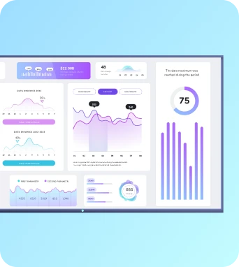
Digitally Display Your Data On TV Screens

Let’s face it: logging into data dashboards can be confusing, frustrating, and time-consuming. And for frontline workers already running on tight schedules, two-factor authentication and limited user licenses could be a death knell for BI adoption.
And if the majority aren’t checking a company device or email? Forget it.
But what if you could securely display your data for all mission-critical teams to see? Better yet, what if you could get around per-user licensing issues and put numbers in front of users wherever they happen to be?
Introducing Fugo — the easiest way to present data dashboards to teams. We’re on a mission to help you securely display business intelligence data on TV screens.
- Want to build a touchscreen interface that lets employees interact with customized flows? Fugo can help you build interactive data dashboards without writing a single line of code.
- What if you want to track real-time performance or forecast numbers throughout the day? As long as your BI tool can do it, Fugo can help you show it off. You can easily display your ad budget and revenue, forecast call volumes for customer service teams, or display changes in tickets or service requests on any screen in your network.
- No more emailing dashboard URLs or paying for user licenses you don’t need. With Fugo, you can display data dashboards with key information at any place, space, or time that works for you.
Curious to see how this works in action? See how Nordward helped drive adoption of their Looker data across their deskless & office employees:
Start With Smaller Bites
You may be tempted to dump a ton of information into your frontline workers’ data dashboards. But as great of an idea as this may seem, you may be (unconsciously) slowing your data adoption to a crawl.
Instead of drowning new learners in a sea of confusing KPIs, why not start with the ‘need-to-know’ numbers instead? You can introduce key concepts in a much simpler data dashboard, then start adding new ideas as employees become more confident.
Let’s look at a few specific examples:
- Sales teams: Start by showcasing basic metrics like the number of new deals closed per month. Then, you can upgrade to showing revenue earned, response time, and even top performers on the team.
- Warehousing: It’s a good idea to begin with real-time data to prevent loads of information from confusing your staff. You can always pivot to more exciting metrics in the future, including numbers pointing to production bottlenecks or shift performance stats.
- Support staff: First, list the number of active support tickets compared with resolved or pending tickets. Later on, you can upgrade to more exciting numbers like response time, FAQs, or customer satisfaction scores.
Lead Employees By Example
The human brain can do something amazing: mimic practically anything without even being aware of it. So if you’re asking employees to do something and not actually doing it yourself, you could be preventing them from learning the ropes effectively.
People prefer to learn by example, and employees want to know what you want them to do. This means you need to be the one logging into dashboards, scrutinizing numbers, and flipping through displays.

Remember: employees need to see you using data, and not just talking about it around the water cooler. Maybe you could try introducing your morning meetings with data, or highlight specific departments based on their performance metrics.
If you show employees how simple it is to use business data effectively, they may start wanting to self-service their own data and drive your mission forward.
Tools To Drive Data Adoption For Frontline Workers
A whopping 87% of business executives say they would be more successful if their frontline workers had access to data. However, just 20% of the same executives say their frontline workers have easy access to the data they need.
Here are some tools you can use to drive data adoption for your frontline workers.
1. Digital Signage Displays With Fugo
Fugo makes it easy to banish inaccessible data with office digital signage tools you can use to display metrics at a glance. It only takes a few steps to get started:
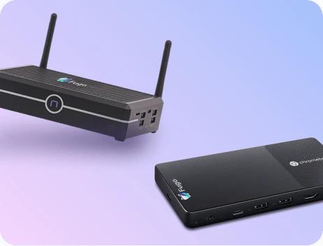
- Connect Fugo with your existing screen or use a media player adapted for your TV. Haven't got a TV? Try creating a Fugo channel to share in a browser link or embedded iFrame.
- Select one of our many integrations with dashboard apps to send frontline business data directly to your screen.
- Use our Secure TV Dashboards feature to connect your dashboard, then push it to your Fugo-connected display or channel.
- Now you can display your business data anywhere you happen to be, from meeting rooms to break rooms to business locations across the country.
Fugo has partnered with hundreds of businesses to take corporate communications to the next level. Think of us like Canva for TV screens, only with even more tools and interactive features. Our goal is to help workers truly engage with data — and not just watch the numbers move.
And by the way: Fugo isn’t just about showcasing business data. You can display all your corporate communications through our simple, safe, and accessible CMS. Since we offer a free trial with no credit card required, you can test our platform in your workspace before paying for a plan.
Why not take a peek for yourself? Go ahead — it’s free!
2. A Different Business Analytics Platform
Before you roll your eyes and move on, hear us out for a second.
Have you wondered if your employee’s low adoption of BI is actually because of the platform you’re using?
We talked earlier about how a steep learning curve could be stopping employees from taking the leap. To summarize: the harder something is to accomplish, the fewer people can get to the finish line.
So why not lower the bar?
If your existing BI platform isn’t gaining any traction, it could be too complicated or difficult to use. Instead, you can try switching to a more accessible platform, including widely-used tools like:
And by the way — Fugo integrates seamlessly with all three platforms.
3. Documentation And Learning Tools
Now that you have a better way to present your business intelligence data, you can lean into some longer-term strategies to upskill current and future employees.
This starts with digital tools, of course.
Documentation and learning tools go above and beyond traditional onboarding sessions. By helping you create a repeatable learning system for all staff members to use, you can help employees increase their technological confidence at any stage of their adoption journey.
For example, you could try:
- Notion, which can help you build digital knowledge bases as a one-stop-shop of information.
- Loom, which can help you design digital video tours of your BI software
- Trivie, which is designed to gamify the learning process and engage frontline workers as they familiarize themselves with your tech stack.
With Fugo, you can easily embed data displays inside Notion and Slack channels so everyone can access consistent information fast.
Bringing Business Intelligence To The Front Lines With Fugo
It may take a while for your frontline employees to get used to using business intelligence tools. But if you’re following best practices and offering other tools to help them succeed, it’s only a matter of time before they start digging in on their own.
All you need is time, some critical thinking, and a sprinkle of patience to empower your frontline team to make data-driven decisions. And if you partner with Fugo to bring your dashboards to the big screen, you can put this data right at their fingertips.
If you’re interested to see what Fugo can do for your business, feel free to book a demo today. We’d be happy to explain the steps involved to broadcast data to your team, then explore how you can use off-the-shelf devices to drive adoption for BI initiatives.
If you're thinking critically about how your frontline & deskless workers can benefit from your investments into work tech, check out our eBook "Leveraging Technology To Connect With Deskless Employees."


