


You know what’s better than creating a dashboard in Power BI? Creating a Power BI dashboard for frontline teams. It’s the easiest way to share key information with on-the-ground pros who don’t have time to check their emails.
So the good news is, Power BI dashboards aren’t hard to make. The bad news is, the sharing function comes with lots of limitations.
You can rest easy knowing we’ve done the heavy lifting for you. This guide explains the step-by-step process for creating a dashboard in Power BI.
It also explains how you can use Fugo’s TV dashboards tool to display dashboards anywhere.
That’s cool, but why do frontline dashboards matter?

Honestly, glad you asked! Because it means you’re getting serious about reaching frontline teams.
The thing is, deskless teams don’t function the same as traditional office workers (or really any office position where people live in their email inbox).
These folks are usually running from location to location, don’t have time to stay glued to their laptops, and are less likely to adopt new innovations.
Let’s face facts:
- You can’t just set up a traditional dashboard and expect deskless workers to see it.
- Your conference room TV isn’t enough to keep everyone informed (especially if you’re managing a remote or distributed team).
- Around 84% of workers saying they get distracted during meetings, which means there’s a nonzero chance your dashboard isn’t getting seen or remembered.
Translation?
You need more than just PowerPoint slides and one-off presentations to help frontline teams maintain access to data.
Nordward realized this quickly. You probably did, too.
So enter the magic of a Power BI dashboard: sleek, accessible, and incredibly versatile for deskless teams. Not only does your data update in real time, but they’re accessible, adjustable, and genuinely helpful sources of information.
For example:
- You can set up a company TV channel and add your Power BI dashboard into your content playlist. Now, frontline workers can log into your channel and see a host of key metrics right on their phones.
- You can display Power BI dashboards on screens in places where frontline teams actually communicate. So deskless workers can see updated information about intake rates, new orders, time constraints, and more.
To summarize: Power BI dashboards make it easier for everyone to create, share, and absorb key information.
Think of it like frosting on a brownie, or a cherry on ice cream — it’s not strictly necessarily, but it makes everything better (and 1,000% more fun).
💡 Related: 6 Reasons You Should Be Using Fugo's TV Dashboards
What you'll need to build a frontline dashboard in Power BI
So Power BI dashboards sound fine and dandy, but do you have what it takes to build one yourself?
If you’re reading this article, you already have what it takes.
The other tidbits and tools are relatively self-explanatory:
- The Power BI Pro plan ($10 per user per month). If you’re planning on using Fugo’s dashboards feature, you only need a single user license. We’ll explain how this works later, no worries.
- A Fugo account. You can get started with our 14-day free trial here.
- Data for your dashboard (or at least an external image URL).
- At least 20 minutes (maybe 10 minutes more if you’ve never used Power BI before).
- Ice cream (not really, but you’re definitely gonna want some after this tutorial).
Got it? Good.
Now, let’s dive in.
How to create a dashboard in Power BI
Before we get too deep into the weeds, let’s make sure we’re speaking the same language.
There are two different ways to collect data in Power BI: dashboards, and reports.
- With Power BI reports, you’re uploading (and displaying) a complete data set. These are typically more granular than what you’d see in a dashboard.
- With Power BI dashboards, you’re essentially creating the CliffsNotes of a report. You’re collecting and sharing the most important information collected from a group of reports on a similar topic.
You can easily use Fugo to capture dashboards and reports by logging into your account and selecting the proper area of your screen.
But suppose you’re still set on capturing a Power BI dashboard.
Here’s how to create a dashboard in Power BI to better serve your frontline team:
1. Navigate to My Workspace on the web version of Power BI. Remember: the Dashboards feature doesn’t work on desktop or mobile. If you’re not a Power BI user yet, you can get signed up here.
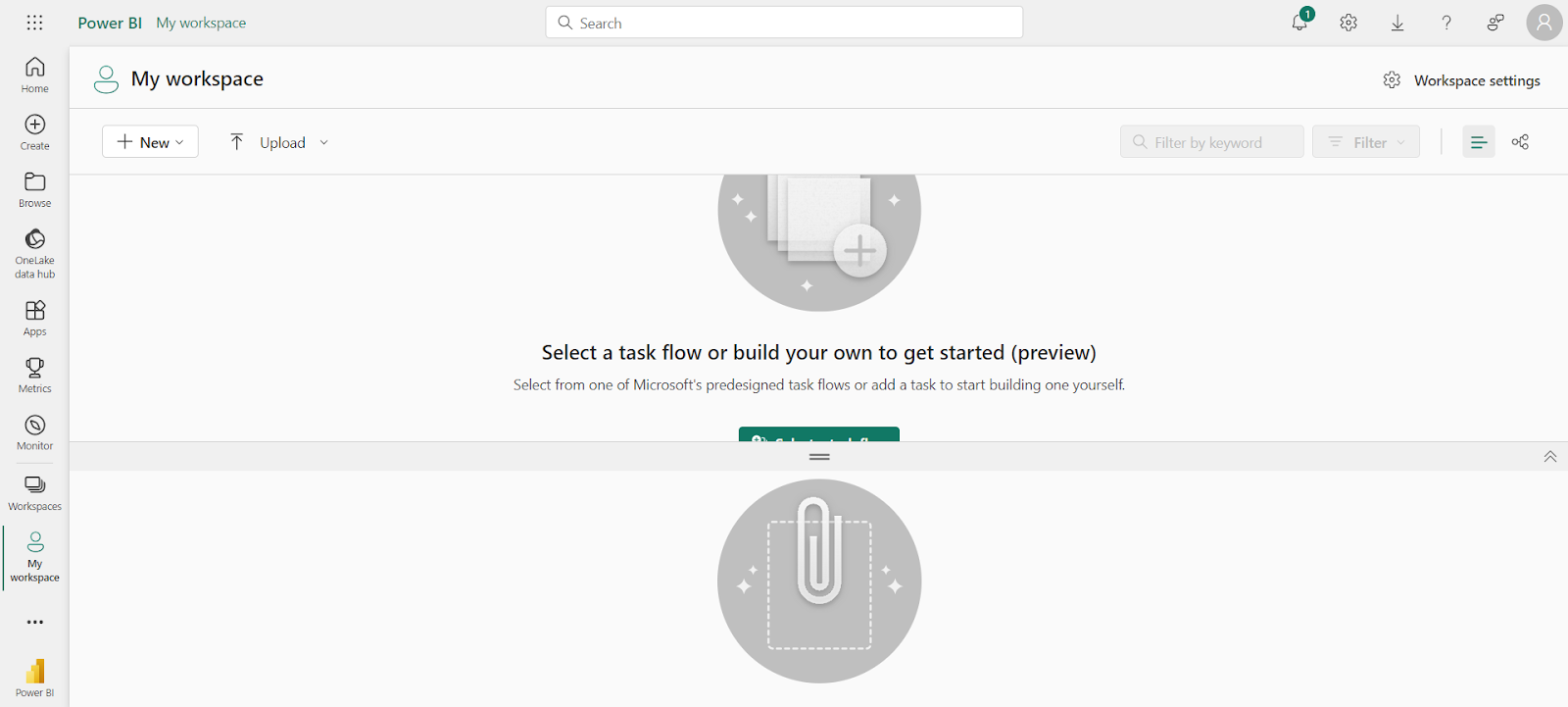
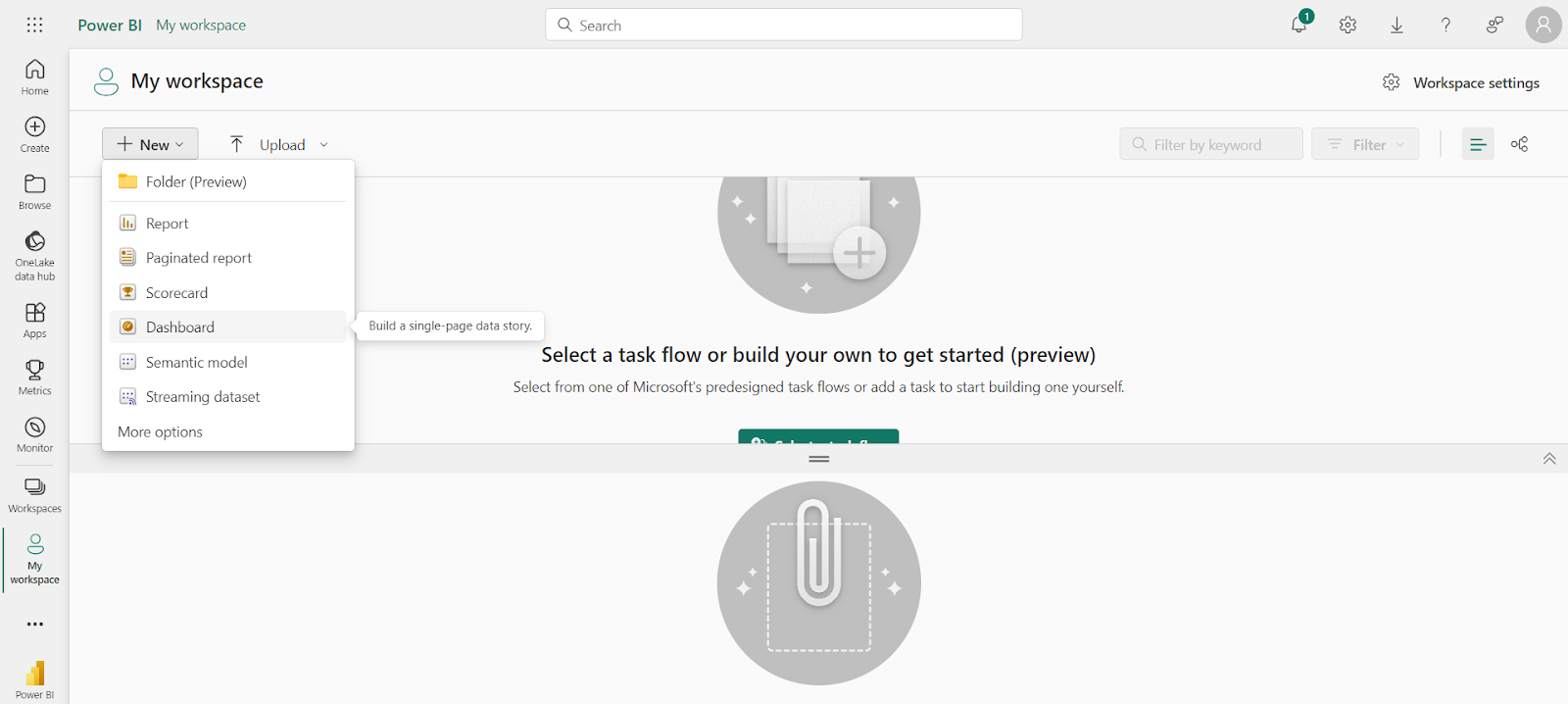
2. In the top left corner of your screen, Tap +New → Dashboard.
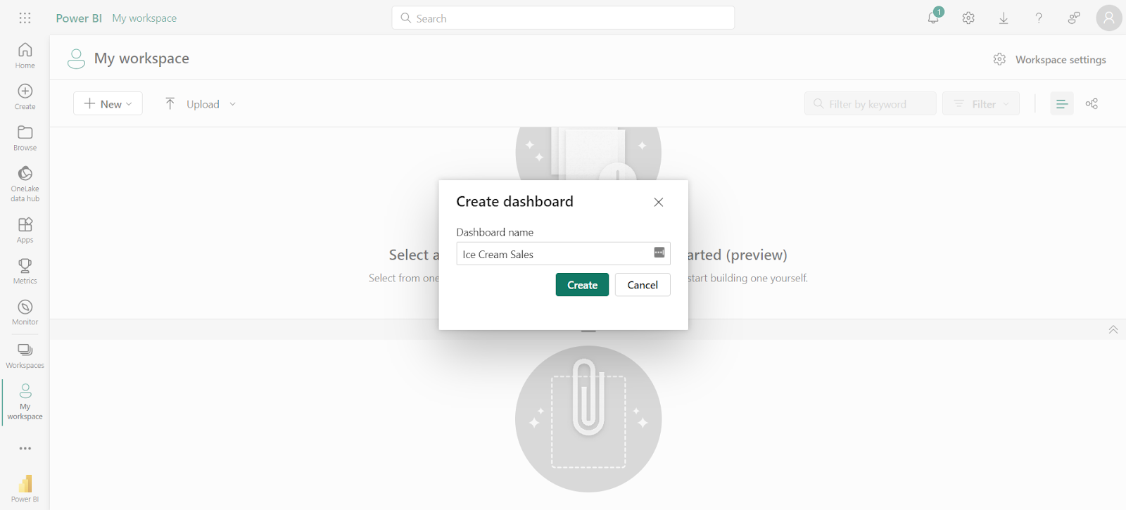
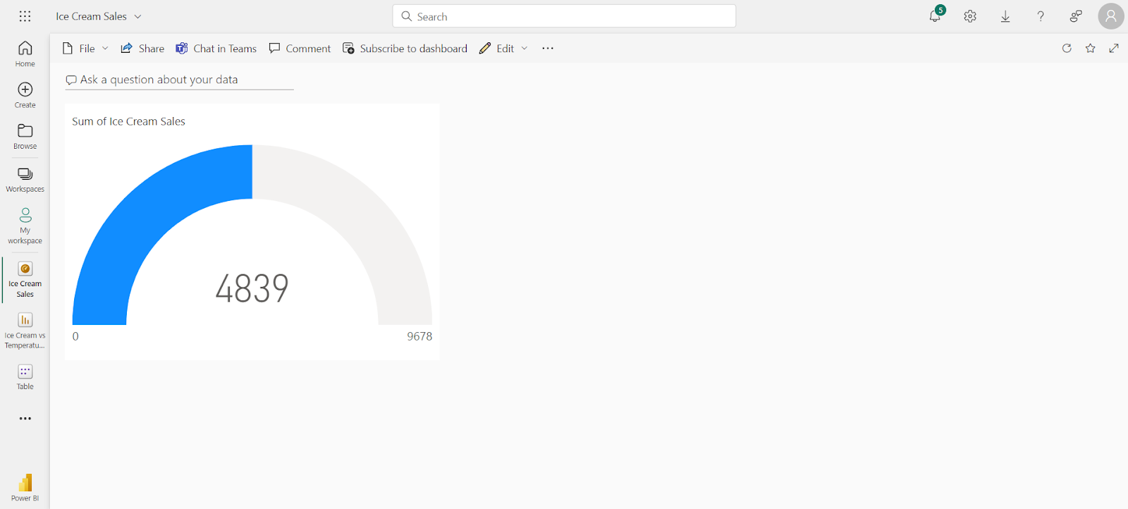
3. Name the dashboard whatever makes sense. We’re going with ‘Ice Cream Sales’ – our goal is to help our frontline team see how much temperature affects ice cream sales (very important stuff, clearly).
Once you’ve named your dashboard, tap Create.
4. You’ll now see a blank screen. Let’s fix that. Tap Edit → Add tile.
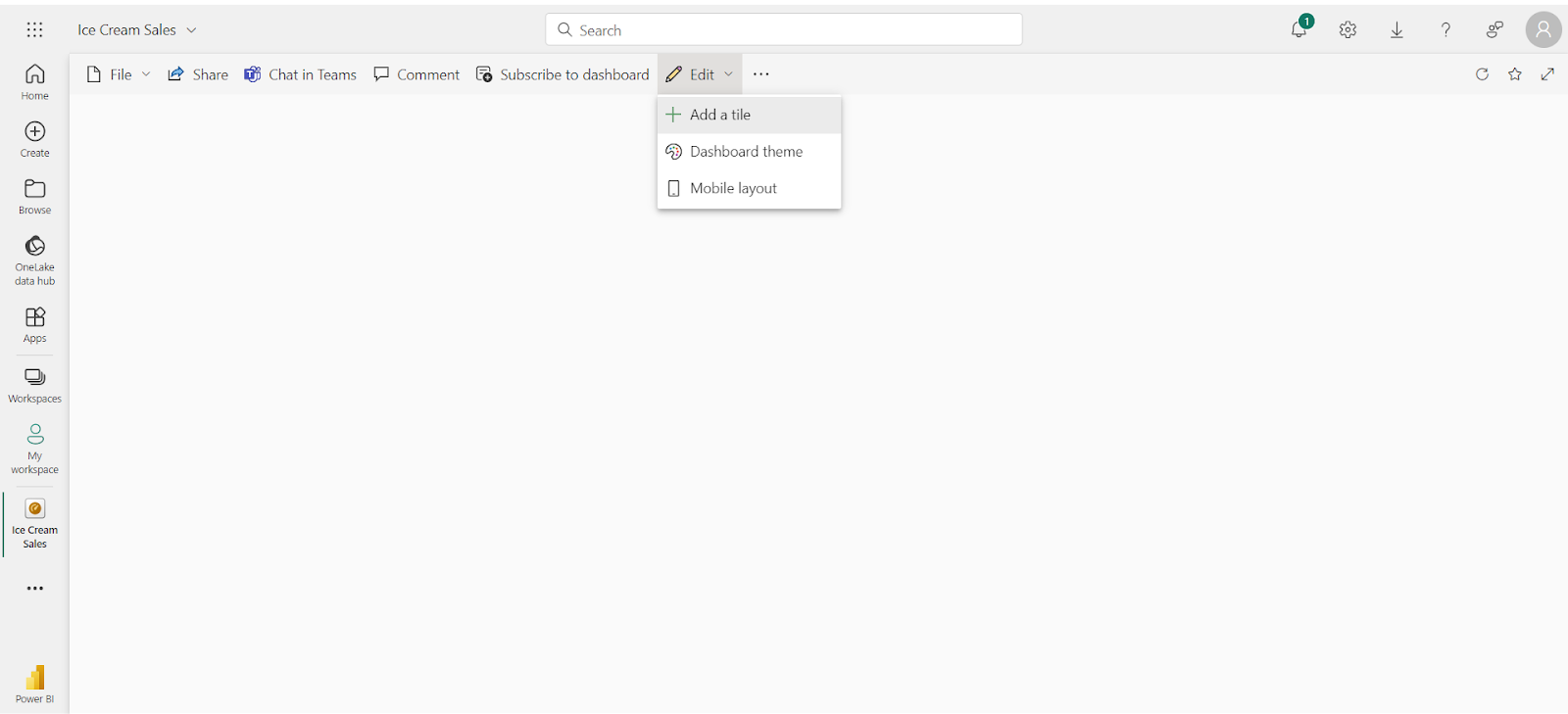
5. You should see a number of options on your screen. To briefly cover each one:
- Image content. This is any graphic with a URL, including internal and external images. Just keep in mind they can’t be dynamic (i.e., GIFs), and they won’t update like other content.
- Text box. You can probably guess what this button adds.
- Web and video content. These are also fairly self-explanatory, but keep in mind you can’t add either without a paid Power BI license.
Looking for data that updates in real time? You can also tap into custom-streaming data from PubNub, Azure Stream, or a third-party API. If you’re not familiar with coding or web content, though, this might be an adventure to save for later.
For now, let’s tap Image and select Next.
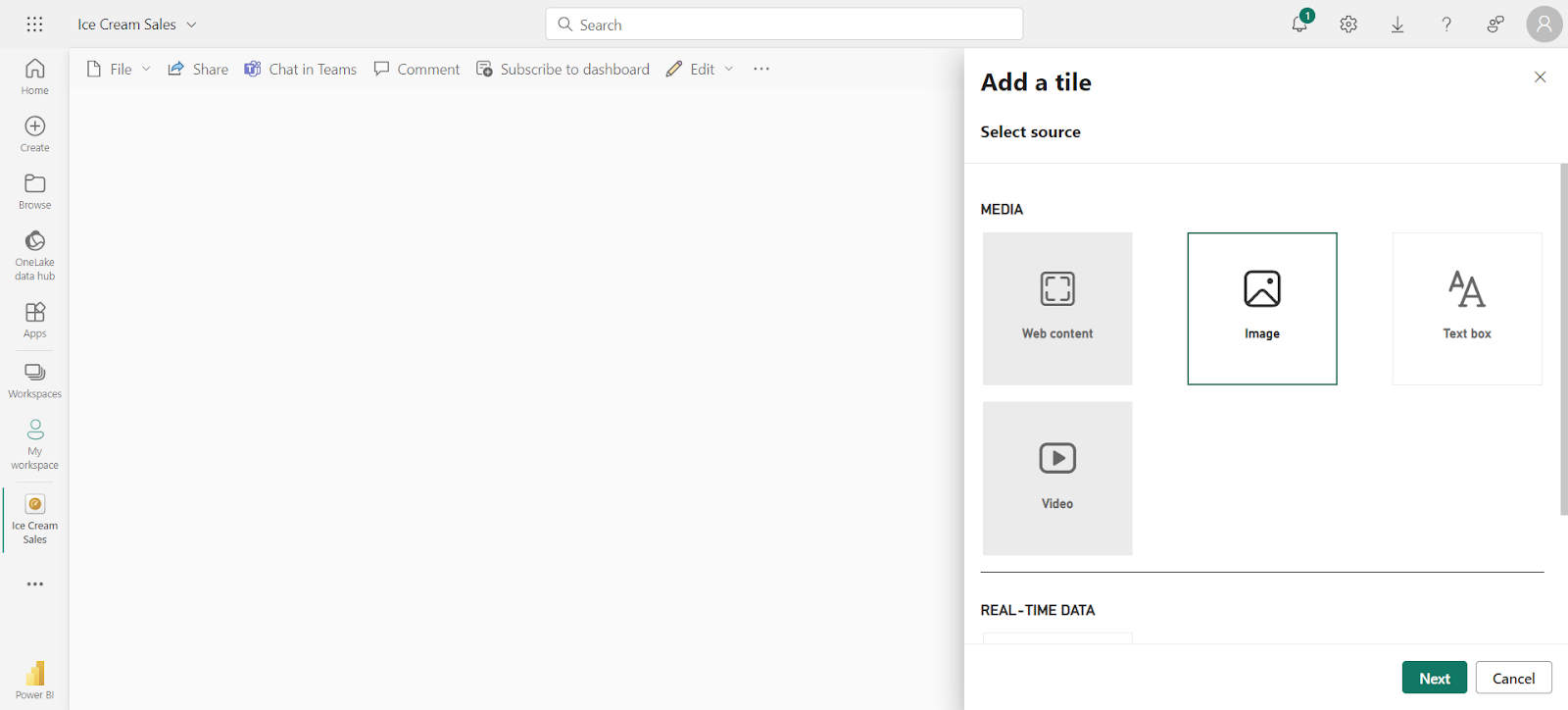
6. You’re about to see a lot of information, but don’t panic! All you need to know is the URL of the content you wish to add. You get to pick if it’s internal or external, depending on the nature or type of content in question.
You probably have some internal assets already, so select Set custom link and add the URL of your image.
7. Once you hit Apply, you’re done! You’ve added your first piece of content to the dashboard.
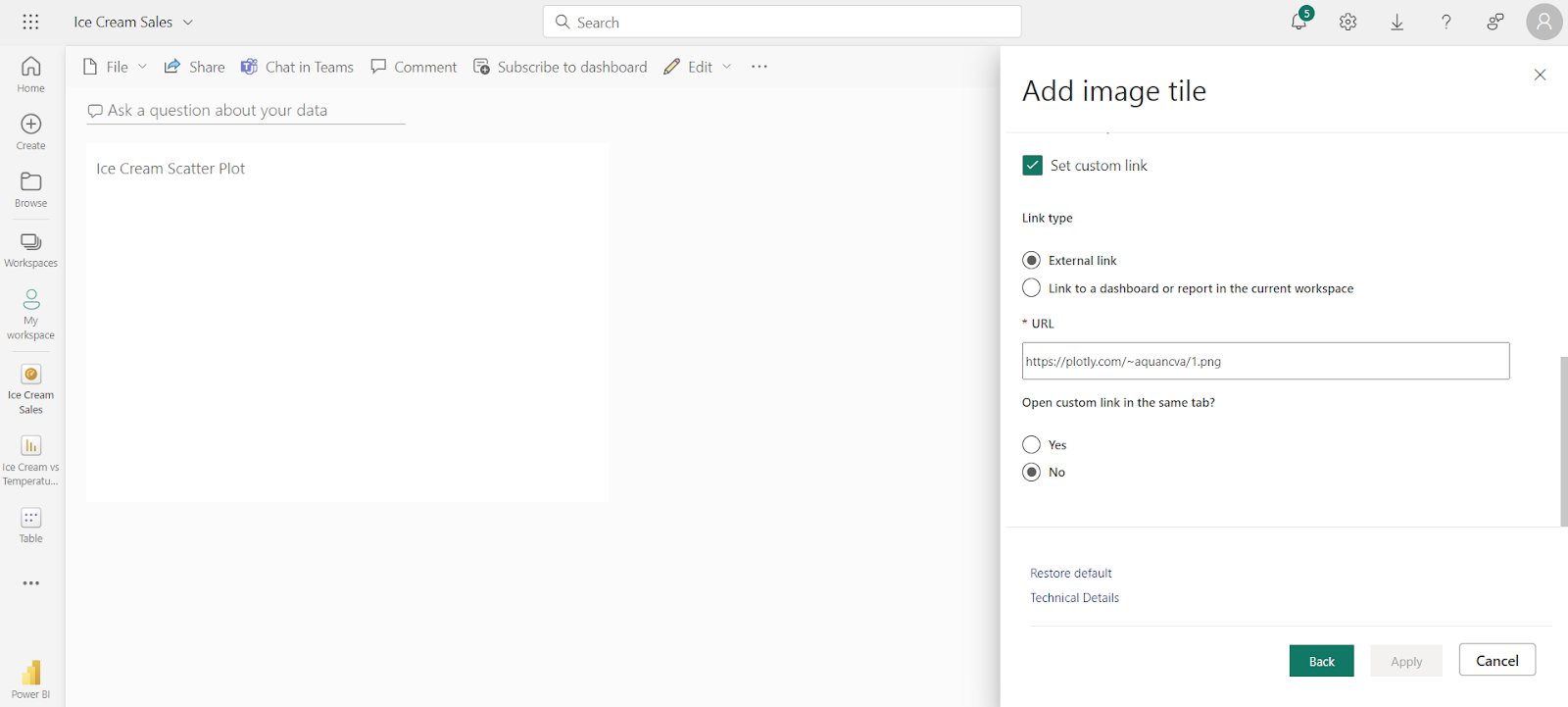
But that doesn’t mean we’re done with it yet.
Here’s how to add your next piece of content.
8. Let’s assume you’re not ready to call it quits — you want to add more data from one of your reports.
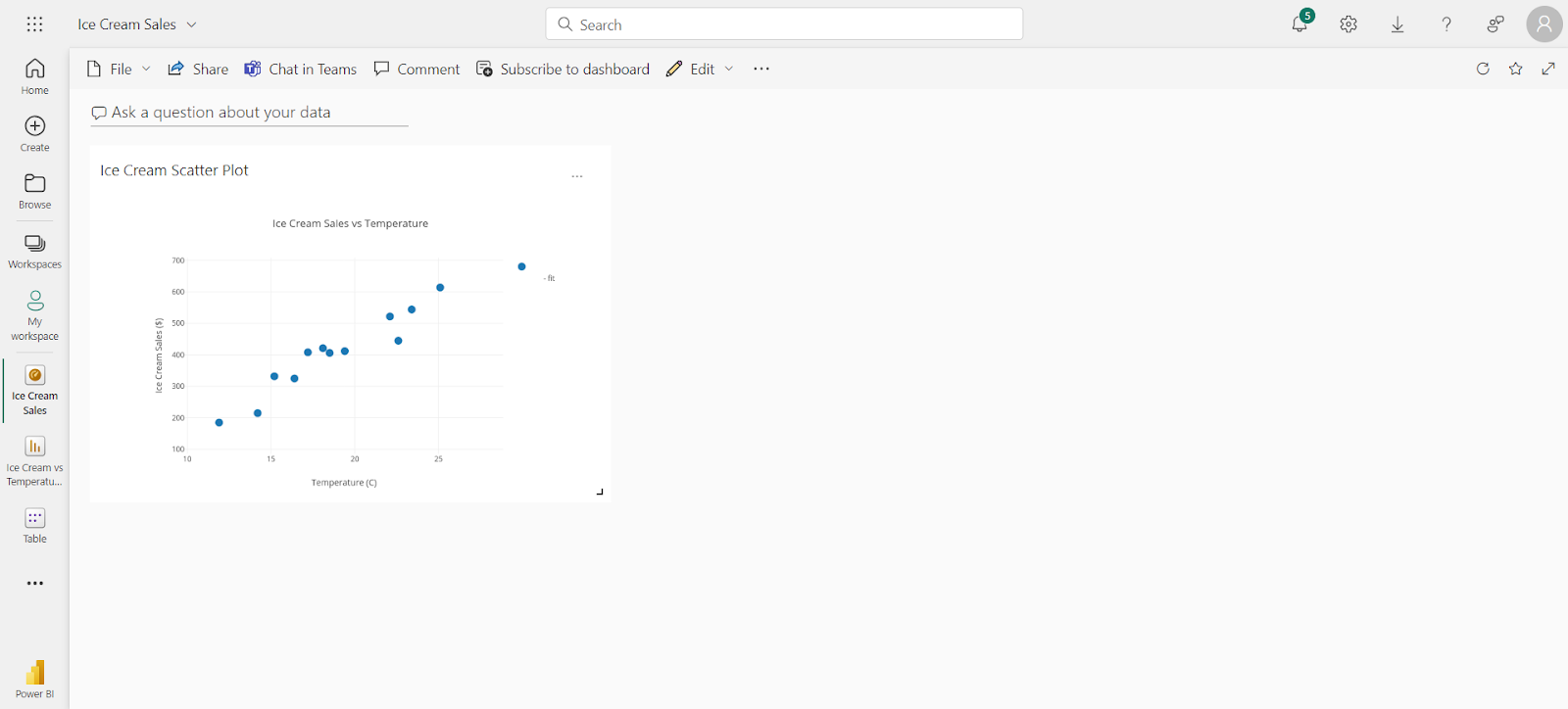
Start by navigating to the report with the visual you want to add. We’re going to use our handy-dandy ice cream report below (obviously).
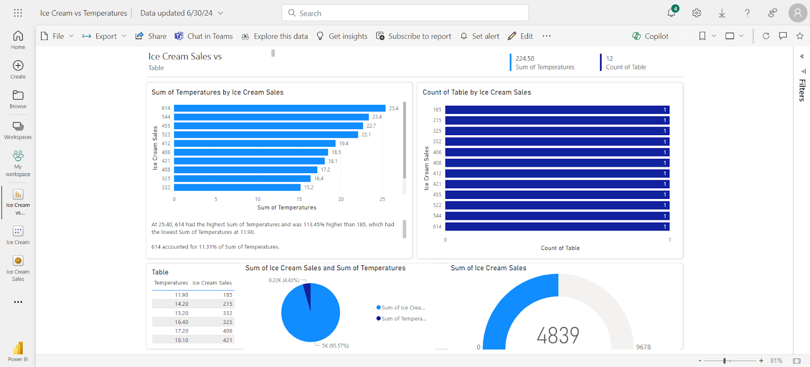
9. Mouse over the visualization you wish to add to your dashboard. You’ll notice a hidden selection bar on the top right. The first option has a pin symbol — that’s the one we want to click.
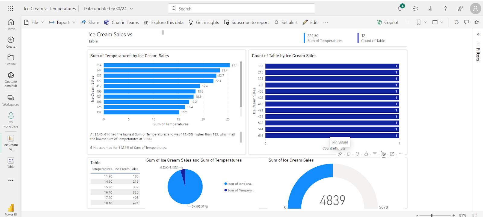
10. You should now see a screen for pinning your visualization to a dashboard. You can either make a new dashboard, or add your visualization to an existing dashboard.
Tap Pin when you’re ready.

11. And that’s it! Navigate back to your Power BI dashboard, and you’ll spot a pinned visual just waiting to be customized.
You’re welcome to update your dashboard theme and customize your mobile layout (if you’re into that sort of thing).
Just keep in mind you can’t share your Power BI dashboard unless you upgrade to a paid plan.
But if you partner with Fugo, you only need a single free Power BI license.
Here’s how to get started in 15 minutes or less.
Now display your Power BI dashboard on TV screens with Fugo
Congratulations, you champion! You just built a Power BI dashboard. Your frontline team is going to love you — and so will your finance department, once you show them how Fugo works.
With Fugo’s Power BI app, you can connect to your Microsoft account, pull up any report or dashboard, then push them to one or many screens from Fugo CMS. This means you can share that data far and wide, with potentially hundreds of people, without spending on expensive viewer licenses.
Here’s the easiest way to get started with Fugo:
1. Log into your Fugo account or sign up for a free 14-day trial.

2. Navigate to your the Apps store and find the Power BI app.

3. Trying the app will launch you into an easy step-by-step interface to configure the app. You'll start by singing in.

- Once you're logged into your account, you can use the settings to select the report or dashboard from your workspace that you want to display.

- There will be a few options to optimize its look and feel on screen, such as scrolling and fitting the dashboard to the screen.

- Once configured, your dashboard will be added to a playlist, ready to be sent to your screens!

You can also configure the app in Fugo's Design Studio - this will give you even more options for optimizing the display for your screens. You can use it to create slides for your dashboards in your company branding, crop dashboards, and loop in animations or live widgets to make the display catch more attention.


💡 Related: Our Dedicated Power BI Integration Is Here!
Get started with Fugo for free
Building and displaying a Power BI dashboard is a powerful way to engage deskless workers. Say goodbye to the clunky PowerPoints and dated workflows of yesteryear — and say hello to simplicity with accessible tools like Fugo.
Fugo makes it easy to keep deskless workers engaged without breaking the bank or driving your graphic designer to tears. You can push content to physical screens, create an online company TV channel, or build meaningful playlists of data-driven content to engage and connect your entire workforce.
Having some trouble getting your Power BI dashboard to load? Just give us a holler at support@fugo.ai.
And if you’re ready to give this whole thing a spin, start your 14-day free trial of Fugo today.
FAQs
Can Power BI be used as a dashboard?
Yup, you can use Power BI as a dashboard. However, you’ll run into limitations whenever you try to share them:
- You can’t make dashboards in Power BI Desktop
- You have to download an app to view dashboards on mobile devices
- You have to upgrade to the Pro plan ($10 per user per month) for the privilege of creating non-personal dashboards
- You can’t share or view dashboards without upgrading, either
The easiest method of sharing Power BI dashboards is setting up a Fugo account. You won’t have to pay extra for Power BI licenses, and you won’t have to force workers to download unnecessary (read: unwanted) third-party apps.
Is Power BI dashboard free?
There is a free plan with Power BI, but you can’t use it to access or create data dashboards. You also can’t view any Power BI content without a paid per-user license, which means every frontline worker (including you!) will need a paid plan. You can avoid this headache with Fugo, however.
How do I create a simple dashboard in Power BI?
It’s easy to set up a simple dashboard in Power BI:
- Open your Power BI client and import data (if you haven’t already)
- Transform your data into visualizations using several built-in tools
- Save or publish your report on the web so users can access your dashboard
Want to push more messaging to deskless workers? You can start a free trial of Fugo today.

